
 Rush's Fifty Something tour kicked off earlier this month, and with every new Rush tour comes a new visual experience for fans. For tours past, Rush was usually touring in support of a new album, and the visuals from that album would then generally drive the visuals for the tour as well. Rush's Fifty Something tour is unique in that the band is not touring to promote a new album; this tour is a celebration of Rush and Neil Peart's 50-plus year legacy. So Rush album artist Hugh Syme had to take a different approach for this tour when tasked to come up with some visual symbology to feature in the band's backdrop videos and merch. Hugh recently spoke with Ultimate Classic Rock for an interview to explain his process for the Fifty Something tour, and how he came up with some of the new visuals - including the new Horns of Odin-inspired symbol:
... "I got word from Allan [Weinrib, Geddy Lee's brother] that Geddy really liked that Led Zeppelin, they all had distinct symbols," he recalls. "[It was similar to how] Prince later had his own symbol that kind of became his quasi-name. But when I heard that he wanted something that indicated three, I started looking at Celtic lore and Celtic imagery that embodied the whole idea of three elements."
"We came across [the symbol that's being used], and my first thought was, 'Well, I think that's also a hazard symbol, like a hazardous material symbol,'" he says. "But it didn't matter, Geddy liked it, so we rendered it in bronze, we rendered it as a watercolor. [There's also] the metal one with the rivets [that] is on Anika's drum kit.
"We just stumbled into it as a symbol [for those particular purposes], but later on, I was doing a poster, there was a coffee cup in [the design] and I put that symbol on the side of the cup. There was some pushback, saying, 'Well, that's where you don't want to have [something that looks like a symbol for] hazardous material, is when you're about to drink something, so that combination didn't work." ...
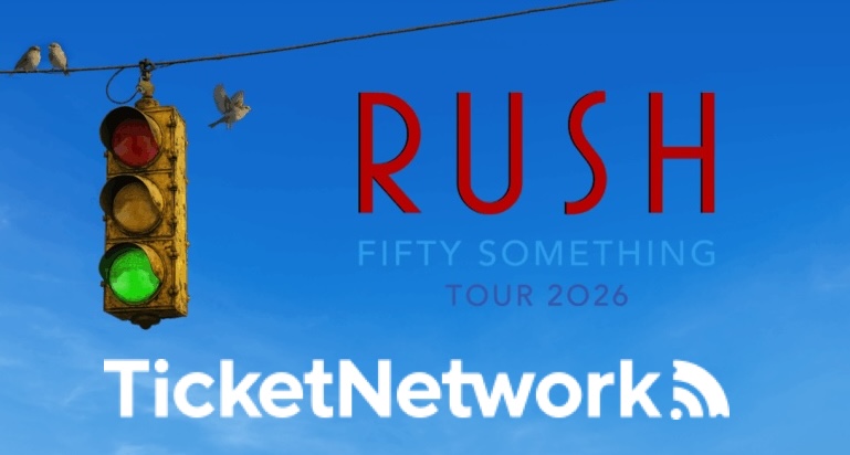
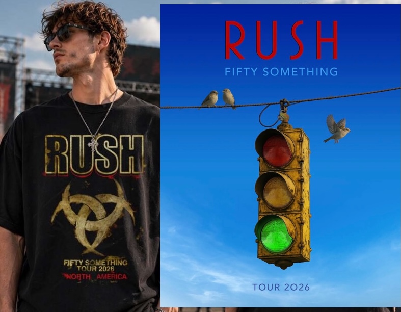
Hugh goes on to explain how the stoplight on the tour logo came about:
... "I knew that we had to have some kind of image that spoke to, it's a go again. We're on again. Somebody gave it a green light, you know? I thought, 'green light, Oh,'" he shares. "So I very literally put a stop light together with the green light shining brighter than the other two."
"It was quite evident that meant that it's a go. The sparrows were an afterthought," he reveals. "I'd already used that motif on some artwork that I did in one of the box sets of Tom Sawyer walking on a fence and sitting on the fence are two sparrows, but flying slightly away from the fence is one sparrow, obviously an allusion to Neil having taken flight." ...
You can read the entire interview online at this location.
