

UPDATE - 11/16@8:02AM:  Amazon has posted an image of the Super Deluxe Edition which shows the hardbound cd case, the comic book open to a page, the cd and the blu-ray disc. You can check out the image here (thanks rosmakloma).
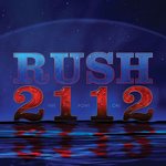 Rush has just posted the cover art for the 5.1 Surround Sound Deluxe Edition of 2112 that they had announced earlier this week, and that we had first learned about a few weeks ago. You can check out a high-res version of the cover here. On December 18th the band will be releasing a CD plus Audio DVD Deluxe Edition, a CD plus Audio Blu-ray Deluxe Edition and a CD plus Audio Blu-ray Super Deluxe Edition. All 3 versions will contain a digitally remastered CD with 3 unreleased live tracks along with a DVD or Blu-ray 5.1 Surround Sound mix of the album. Also included in each version will be expanded artwork, liner notes, lyrics, unreleased photos and brand new liner notes by David Fricke. The Super Deluxe version will be housed in a hardbound book with a 40 page comic book by story artist Tom Hodges. The DVD/Blu-ray also contains a digital version of this comic book. For all the details and technical specs, check out the Rush.com press release. You can pre-order your copy today at Amazon:
[pre-order CD+DVD Deluxe Edition]
[pre-order CD+BD Deluxe Edition]
[pre-order CD+BD Super Deluxe Edition]
Related Posts:
[Rush releases details regarding the Super Deluxe reissue of 2112]
[Super Deluxe CD/BD reissue of 2112 coming December 18th]
